Focus management
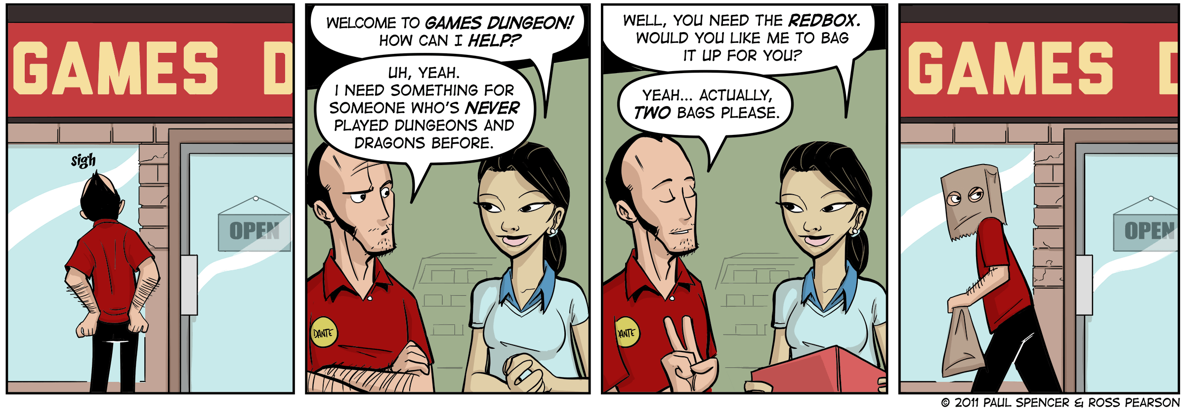
The tab key on the keyboard lets users navigate between panels in your comic strip. The panels in focus is highlighted with a thickened frame border.
Engineered for screen readers
The frame in focus features text specifically written for screen readers. It describes the setting, the characters speaking, the dialogue, along with anything else necessary to convey the meaning of the frame contents.
Best practices
The comic includes semantic HTML5 markup that includes WAI-ARIA attributes to aid assistive technology.
High contrast mode
Each frame contains the source content for both full-colour and uncoloured artwork, with a “High contrast” setting that switches between them. We recommend uncoloured, line-art artwork as a high contrast option for users with visual impairments.
Closed captions
If there's too much visual stimulation within the comic frame, the closed captions feature provides a script of each frame. We include the name of each character speaking, along with an avatar of that character.
The speaking subject is highlighted to aid identifying who the closed caption belongs to.
Closed captions supports tab focus, left and right button and also arrows.
Increase / Decrease font-size
While in closed caption mode, you can control how large or small you prefer the font.
Selectable text
Each speech bubble is positioned on top of the artwork using font-face and custom comic book fonts.
Translatable text
Because the text is rendered on the page as text, it means we can translate. You're welcome! Or should I say... ¡De nada!
This is the largest technical challenge posed to the project. While it doesn't work well all the time, it does work and we think that's pretty remarkable.
Left-to-right & Right-to-left reading support
Because not every language reads left-to-right like English and French, the comic layout artwork and bubbles inverses to read right-to-left upon translated where needed.
Programatic bubbles
Using javascript, SVG and a lot of math, each speech bubble is assembled on the fly, based around the width and height of the text contained within. Each bubble accepts parameters that set the position of the spike (left, center or right), the direction the spike curls (left, center or right) and how long the spike is (short, normal, long, variable). Because it's constructed on the fly, it can be moved, altered or resized.
Responsive layout
CSS Grid and media queries adapt the layout of the comic to suit any screen size. (Say hello to mobile-friendly comics!)
Responsive images
Using the picture element and source queries, we serve the correct size and density to suit the device. (No more fuzzy iPhone toons.)
Lazyload
Each image is only fetched from the server once the page has loaded, ensuring speed and performance come first.
